

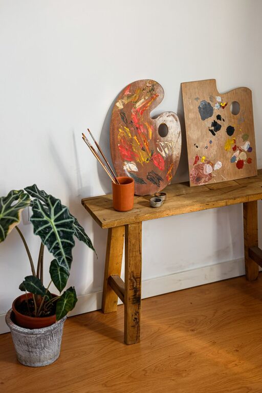
Creating a peaceful and relaxing environment in your home starts with color. Choosing calm colors can influence your mood, help reduce stress, and make your space feel inviting and comfortable. But with so many options available, where do you begin? This guide will walk you through helpful tips for selecting the perfect calm colors that suit your style and enhance your living space.
Why Choose Calm Colors?
Calm colors are shades that evoke tranquility, restfulness, and balance. They tend to be soft, muted, and easy on the eyes. Incorporating these colors can:
– Reduce anxiety and tension
– Promote relaxation and restful sleep
– Create a sense of spaciousness and light
– Provide a neutral backdrop for other décor elements
Popular calm color families include soft blues, gentle greens, warm neutrals, and pale lavenders. Each can influence the feel of a room differently.
Consider the Room’s Purpose
Start by thinking about how you use each room. Different activities call for different moods:
– Bedrooms: Ideal for soft, cool tones like pastel blues or greens, which encourage restful sleep.
– Living rooms: Warm neutrals, muted yellows, or gentle grays work well to create a welcoming space for conversation and relaxation.
– Home offices: Soft greens and blues can improve focus without being distracting.
– Bathrooms: Light blues and seafoam greens evoke cleanliness and calmness.
Keep in mind how natural and artificial light affects the colors in each room.
Test Colors in Different Lighting
Colors can look very different depending on lighting conditions. To ensure your calm color choice works well throughout the day:
– Paint a small section of your wall and observe it at different times.
– Notice how sunlight enhances or dulls the color.
– Check the color under your regular indoor lighting (warm or cool bulbs).
This testing helps avoid surprises and ensures the color contributes to a peaceful vibe.
Use Color Psychology to Your Advantage
Understanding color psychology can guide your decisions:
– Blue: Often linked with tranquility, security, and calmness. Great for bedrooms and bathrooms.
– Green: Symbolizes nature and renewal. Ideal for spaces where you want to feel refreshed.
– Lavender: A soft purple shade that inspires relaxation and creativity.
– Beige and warm neutrals: Provide a cozy, grounded feeling without overwhelming the senses.
Avoid overly bright or saturated shades if you want to maintain a calm atmosphere.
Create a Balanced Palette
Calm colors don’t mean boring or monochromatic. Mixing various shades and textures can add depth and interest:
– Combine light and medium tones within the same color family.
– Use contrasting textures like matte paint with soft fabrics or wood accents.
– Introduce subtle accent colors to avoid a flat look, such as soft coral pillows against a light gray wall.
Balancing colors keeps your space lively without sacrificing tranquility.
Think About Finish and Texture
The finish of your paint can affect the mood:
– Matte or eggshell finishes tend to soften colors and reduce glare, enhancing calmness.
– Glossy finishes reflect more light and may feel less restful.
Also, consider the textures in your room. Soft fabrics, natural fibers, and smooth surfaces complement calm color schemes well.
Incorporate Nature-Inspired Elements
Colors inspired by nature are inherently calming. Look to earth, plants, and water for ideas:
– Soft blues like sky or ocean tones
– Gentle greens resembling leaves or moss
– Warm neutrals that mimic sand or stone
Pairing these colors with natural materials like wood, stone, or plants creates a cohesive, soothing environment.
Avoid Overusing Dark or Very Bright Colors
While darker colors can be cozy, too much can feel heavy or oppressive. Similarly, very bright colors can be stimulating rather than calming. Use these shades as accents rather than the main color to maintain balance.
Final Tips Before Painting
– Use sample paint pots to test a variety of calm colors.
– Consider painting large boards or poster panels for portability.
– Review inspirational photos from magazines or online sources.
– Don’t rush: give yourself time to live with samples before committing.
Conclusion
Choosing calm colors for your home is an effective way to create a soothing retreat from daily stress. By considering room function, lighting, color psychology, and balance, you can select hues that promote relaxation and comfort. Remember to test colors thoroughly and embrace natural, muted tones to craft a peaceful living space you’ll love.
With these tips, your home can become a haven of calm, reflecting your personal style while supporting your well-being. Happy decorating!